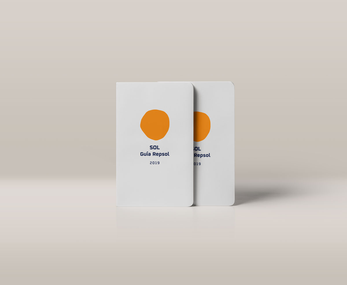
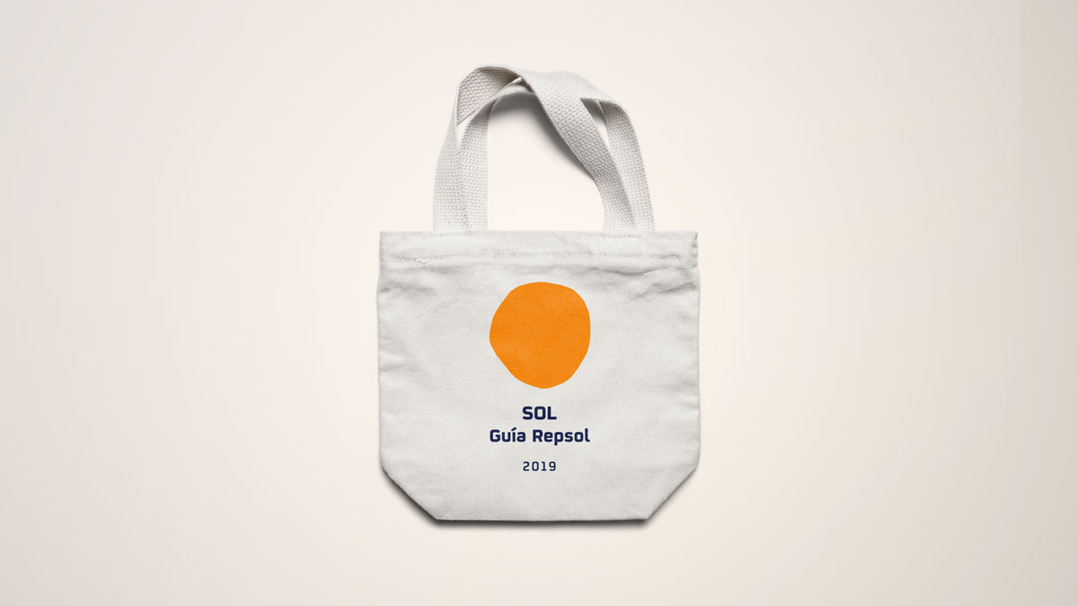
SÍMBOLO SOL
GUÍA REPSOL
ABOUT
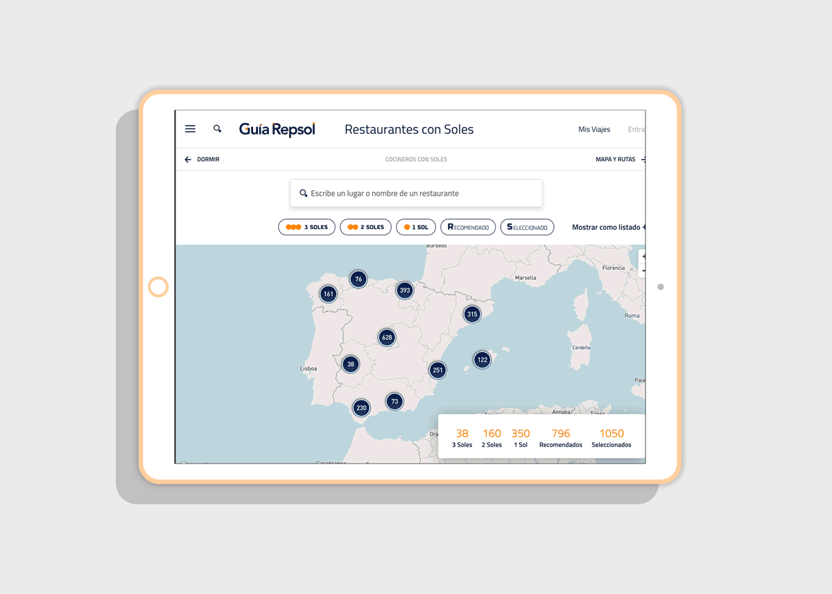
We were commissioned to update the brand identity of Soles Guía Repsol, the iconic symbol of culinary excellence demonstrating Repsol’s connection with and support for Spanish and Portuguese gastronomy.
We designed a flexible identity, based on the organic shape of the sun, and the idea of its movement through the day, taking it to a more contemporary context without sacrificing its corporate personality.
WORK
Branding
CLIENT
Guía Repsol
Branding
CLIENT
Guía Repsol

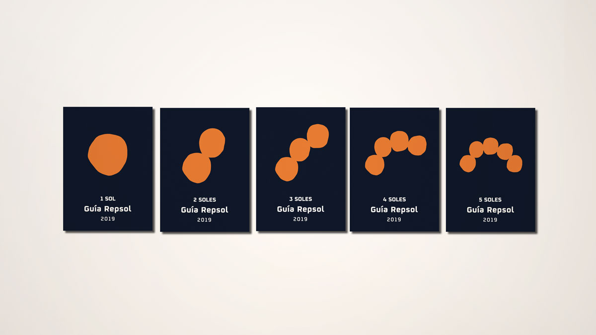
The design of the new Sol Guía Repsol tries to convey the idea of an organic sphere that travels along a curved path. It is an organically shaped sphere, with no defined limit.


Depending on the time of the day, the image of the sun is always different. There is not a certain shape or fixed image of the star, since it does not stop mutating, due to the constant movement of earth.
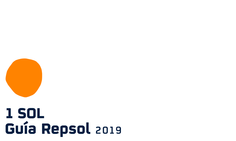
The new logo represents different moments of the day, in which the sun moves drawing different light landscapes.